

The background
To start, why?
Icesi University had a repository of about 350 links directing users to platforms or offices that provide administrative services, such as loan books, room rentals, video projectors, etc. This repository was not easy to use; users took more than two minutes to find a service in their first contact and sometimes came to services that did not apply to their profile within the university.
The challenge
Understanding business needs
Each office serves people with different interests, needs, schedules, and degrees of access to information; we need to unify all this information in one place to present it in an accessible manner taking into account the profile of the user query, ensure access from different devices and allow it to be easily found in search engines even outside the university.
The research
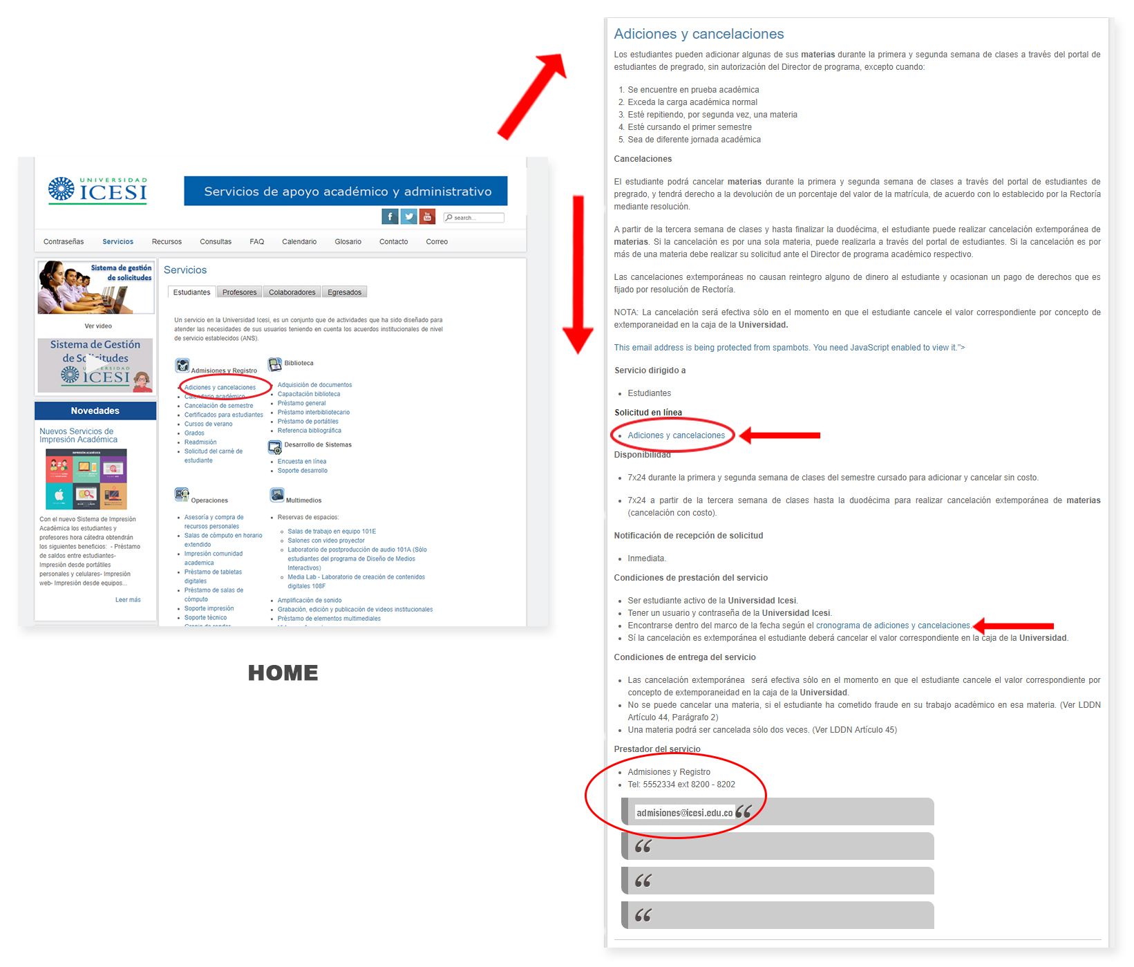
This was the start screen; all links had a presentation in list format, and the user should carefully read each link to find the service; there was a categorization of who provided the service and to whom it was directed.
You can see the entire route that a user had to do to identify the service; they had large blocks of information and multiple links that did not allow them to determine where to access.
Gathering insights from users
I began to identify key user groups attending offices, detecting four key segments: students, teachers, workers, and graduates. An archetype was developed for each person, and they began to group essential services.
Later, we made multiple sessions of co-creation with the heads of each office to find their main points of pain; I found it was not easy for them to explain that some services were virtual and others in face, plus some did not work on Saturdays or night time.
This same activity was carried out with students and staff support areas finding that it was not easy to remember the names of the services nor identify which leadership belonged.
The discover
Findings from interviews and co-creation
All groups evaluated to identify problems found direct access to the service had difficulty reading a lot of content to meet the person in charge of providing the service, access requirements, and terms of use.
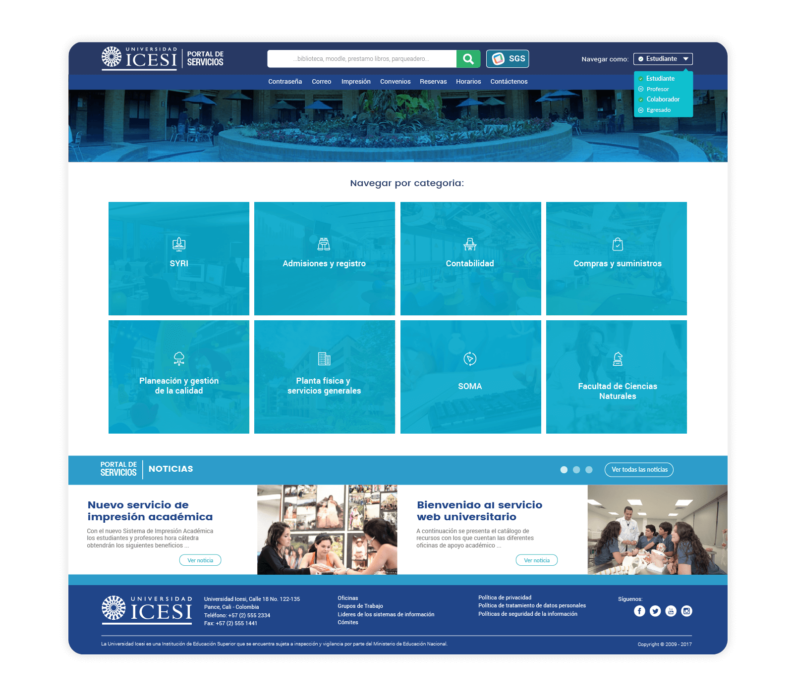
For the group of students, faculty, and staff was essential to find the shortcut to the platform report cases and incidents known as SGS.
Four interest groups had standard recurring services and transversal to all areas, such as: reset passwords, access to institutional mail, computer rooms, etc., which suggested a set of shortcuts.
The approach
Designing experiences
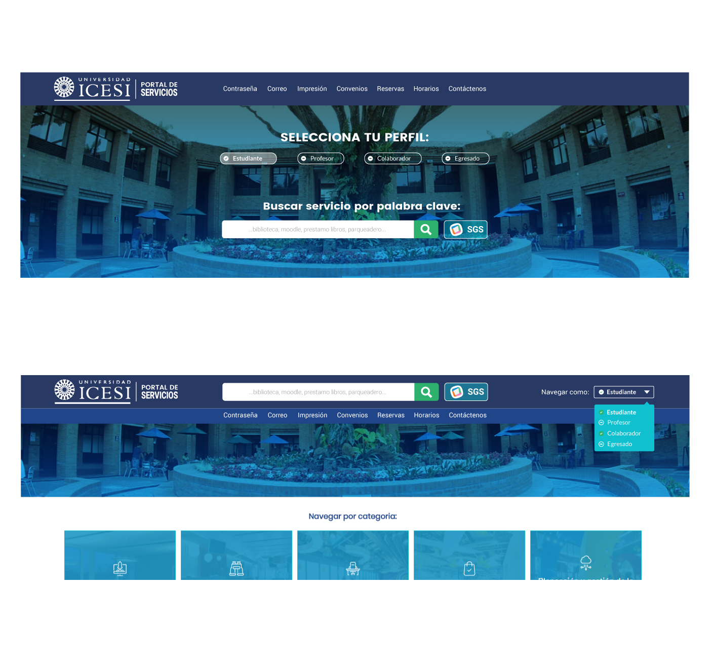
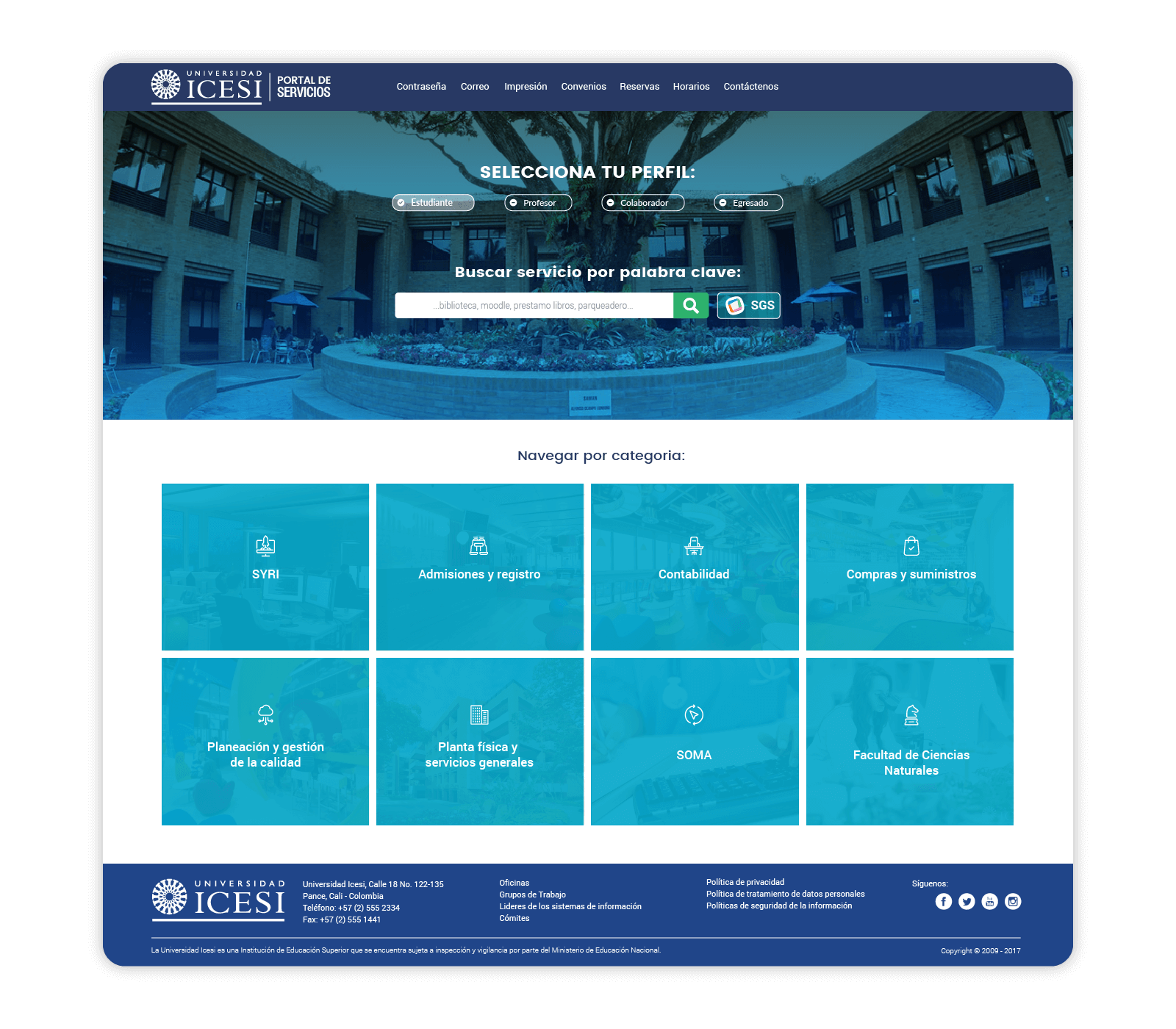
Based on the findings, I decided to allow the user to choose the profile they want to navigate; even they can be combined for users with multiple profiles.
We need to create a hierarchy of information that reduces the number of clicks users, and administrative staff provides site management.
It should be an accessible platform for indexing in search engines, available from any mobile device, and a search engine allows finding services even if they know your name.
The concept
Crafting experiences
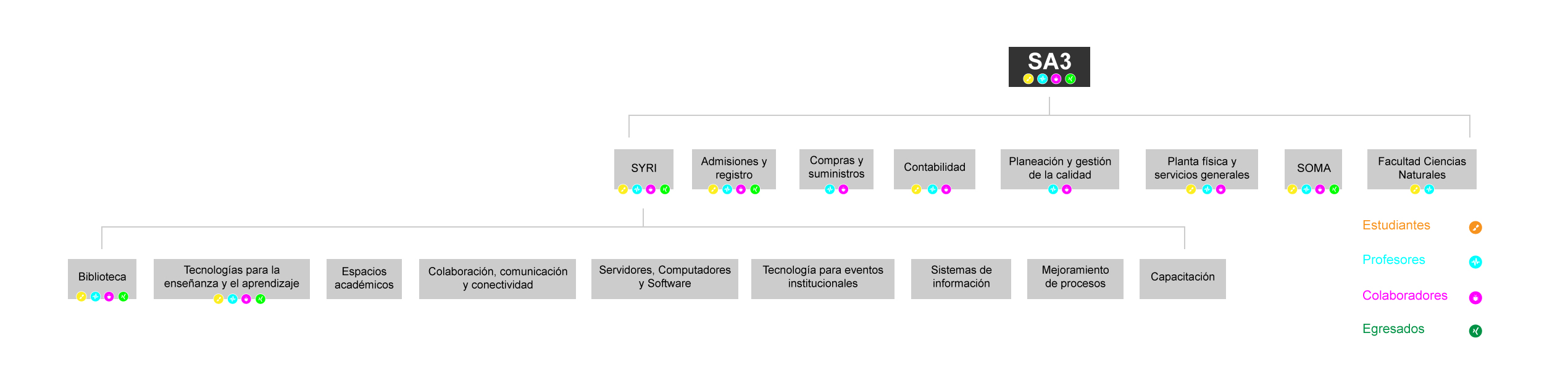
This directory has an institutional and modern appearance and iconography for each office, facilitating their identification; information architecture is based on the university’s organizational chart. It has a search engine to find based on words related services.
Each service has a clear call to action, critical data access, a direct link to SGS, and a button bar that condense the extensive information.
The design
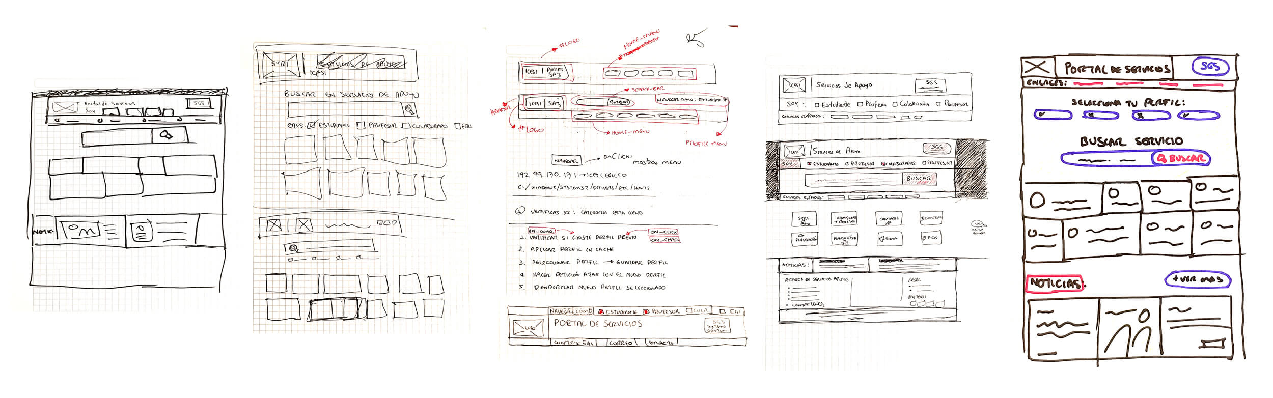
Paper first
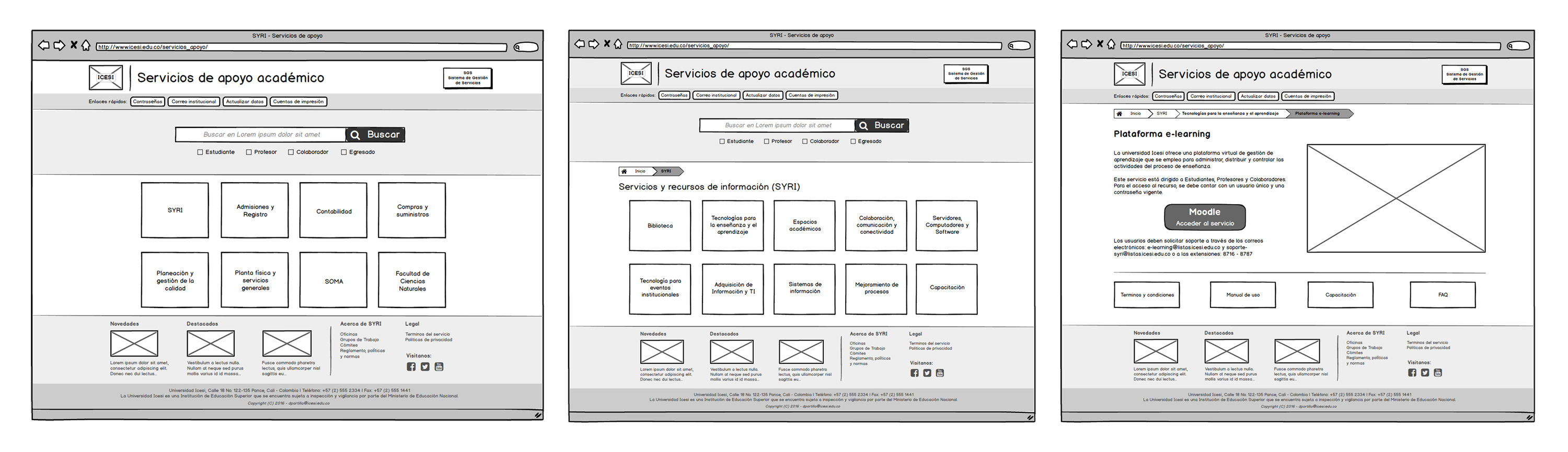
Wireframes v1
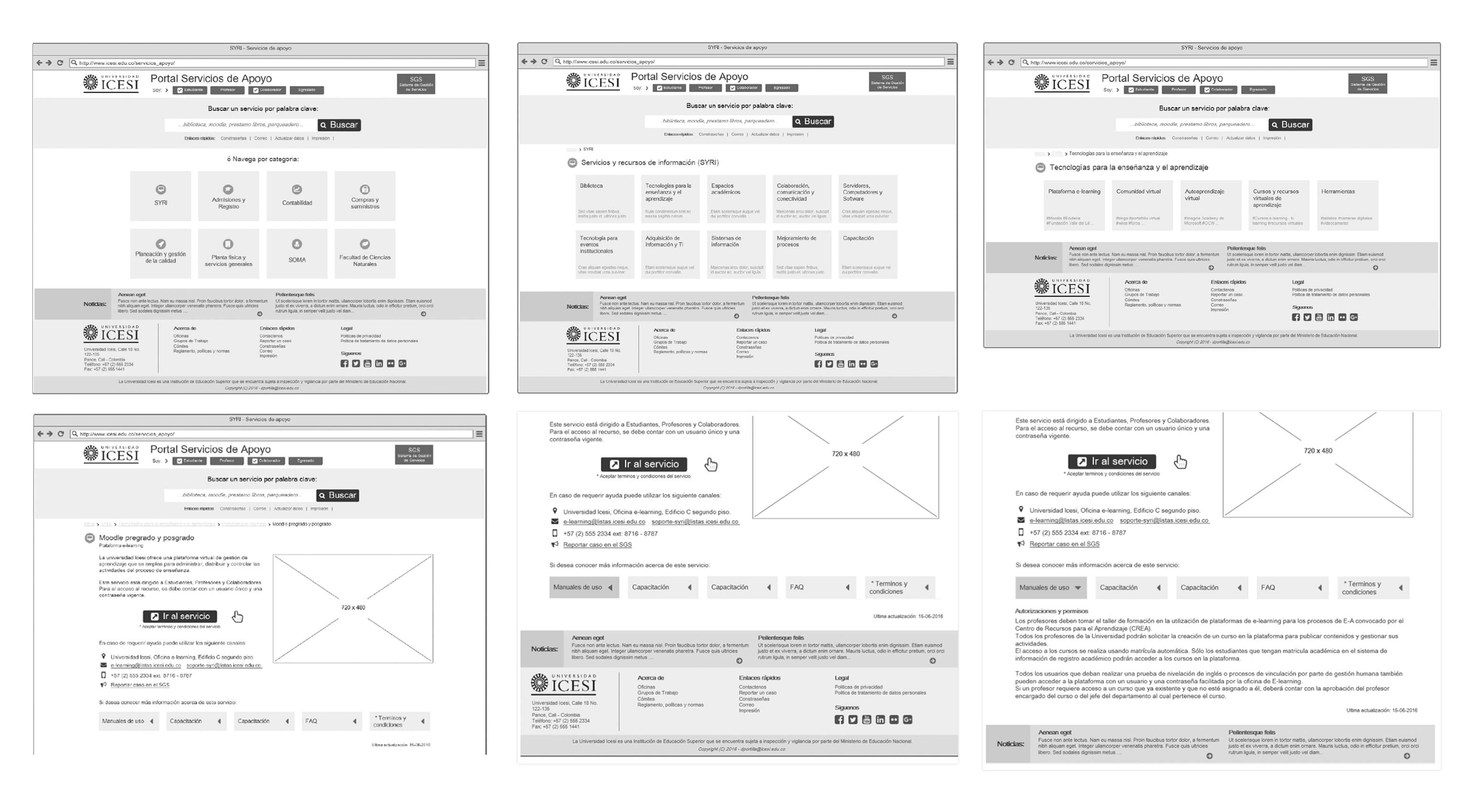
Wireframes v2
Sitemap
The development
Time to code
I developed a menu that lets you choose the profile to filter the site’s content; with the help of variables login, the browser stored the profile for future sessions to avoid having to make the selection again.
All the queries of the services to the server were done through Ajax requests, allowing the reloading of only a fragment of the site, consuming fewer data, and reducing the response time.
All services were created in the backend with metatags and related keywords to facilitate engine search and indexing.
A breadcrumb module was developed to show the hierarchy of the navigation and to be able to change sections easily.
The delivery
Visual design
Boom!!!
View project
Icesi Portal Services
The results
A new directory
The site went from 2.5k to 8k monthly visits, an accurate record for an institutional channel, visits from mobile devices increased by 15%, and the distribution is divided into 78% desktop and 22% smartphones.
On average, the site bounce rate per month is 9%, and the average duration is 43 seconds, validating that people quickly find information and continue to the service.
Shortcuts in the site’s header are used by 75% of visitors being able to reduce the searches within the area, and the changes made save, on average, three clicks on navigation.
All services were correctly indexed in search engines, helping external users quickly find the desired information.
The number of office visits declined for information by 15% due to the ease of finding via the web and the ability to share the link service access.
Major learnings
Whenever a redesign process is somewhat slow, you need to start pressuring customers from the beginning of the project to deliver information; in this case, the site was ready three months later and went live because of the delay in updating the information.
These institutional processes must be supported with an excellent internal communication campaign; we ran into listless users who resist change and see no need to change how they have operated their office for years.
This project was developed in 4 months.
The team
Sandra Paulina López, Chief Officer SYRI
Mauricio Silva, Product Owner
Ingri Lorena Jojoa, Scrum Master
David Portilla, Frontend / UX