

The background
Tell me your story
A few months ago, Icesi Library was facing the challenge of not having more shelf space to store all references to the university community demand; this is the reason the principal’s office decided to migrate all its contents, took a digital environment semester to semester, and expanded its digital collection.
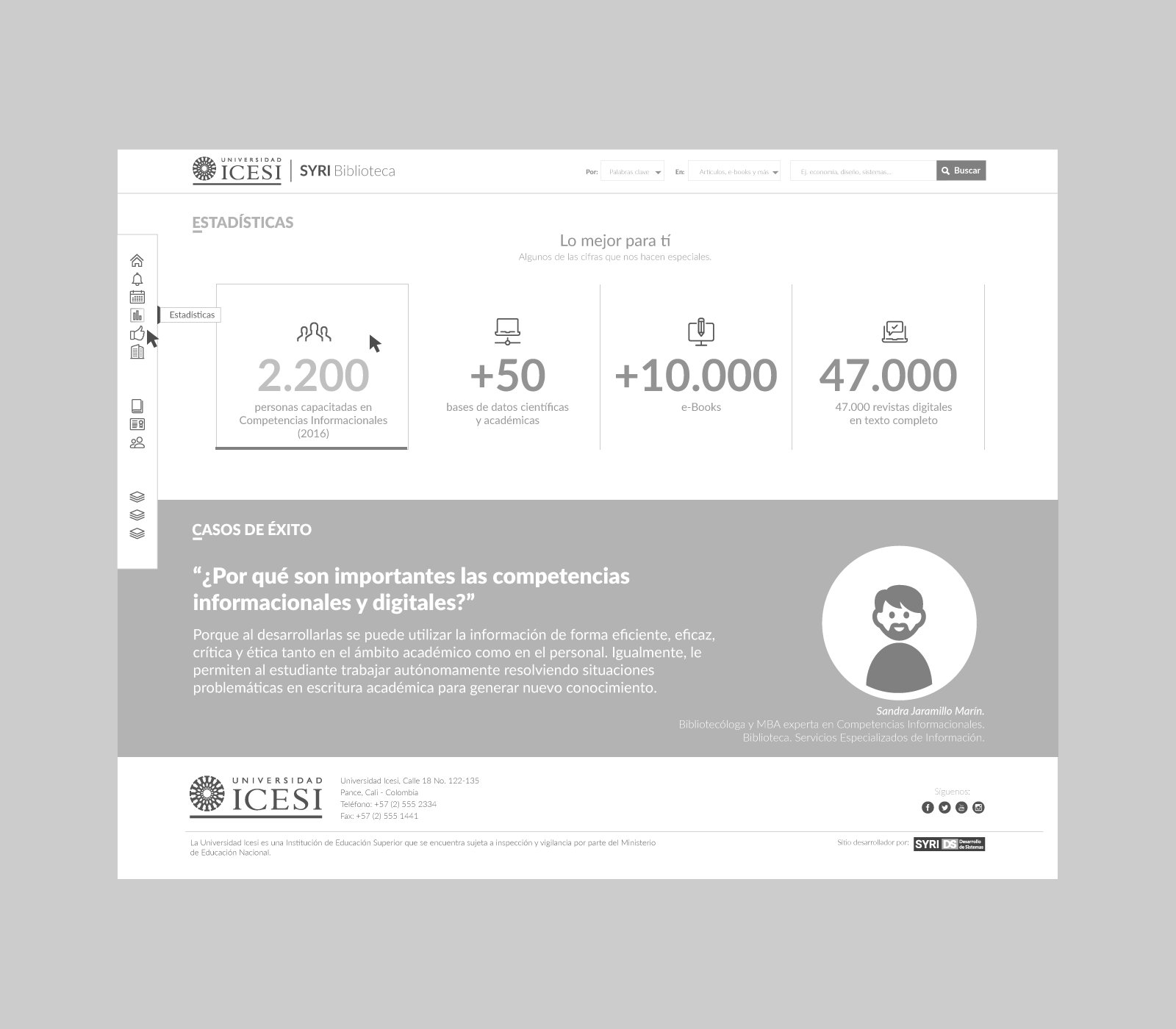
Currently, the Library has more than 47,000 scientific journals, more than 10,000 digital books, and access to more than 50 academic and scientific first-level databases, allowing you to have excellent educational and digital research material. By order of the university, all his students’ research projects and theses must be indexed in a digital library.
All this effort should be made visible on its website, and it should not have limited access to one computer on campus.
The challenge
What problem do you want to solve?
This involved two challenges, the first; migrating from a traditional loan scheme of physical books to a delivery model library services of online publications, where the community knew all computing resources that account for and could access them easily.
The second, at the technical level, required a robust and user-friendly web portal that would support the entire operation of this scheme of service.
Until now, they received multiple complaints about the website not being accessible from cell phones, as they had an ancient content manager (CMS), and they have much tricky management of new content to its officials.
The approach
Digital product discovery
After several meetings with officials of the Library and the primary users of their services, they made the following requirements:
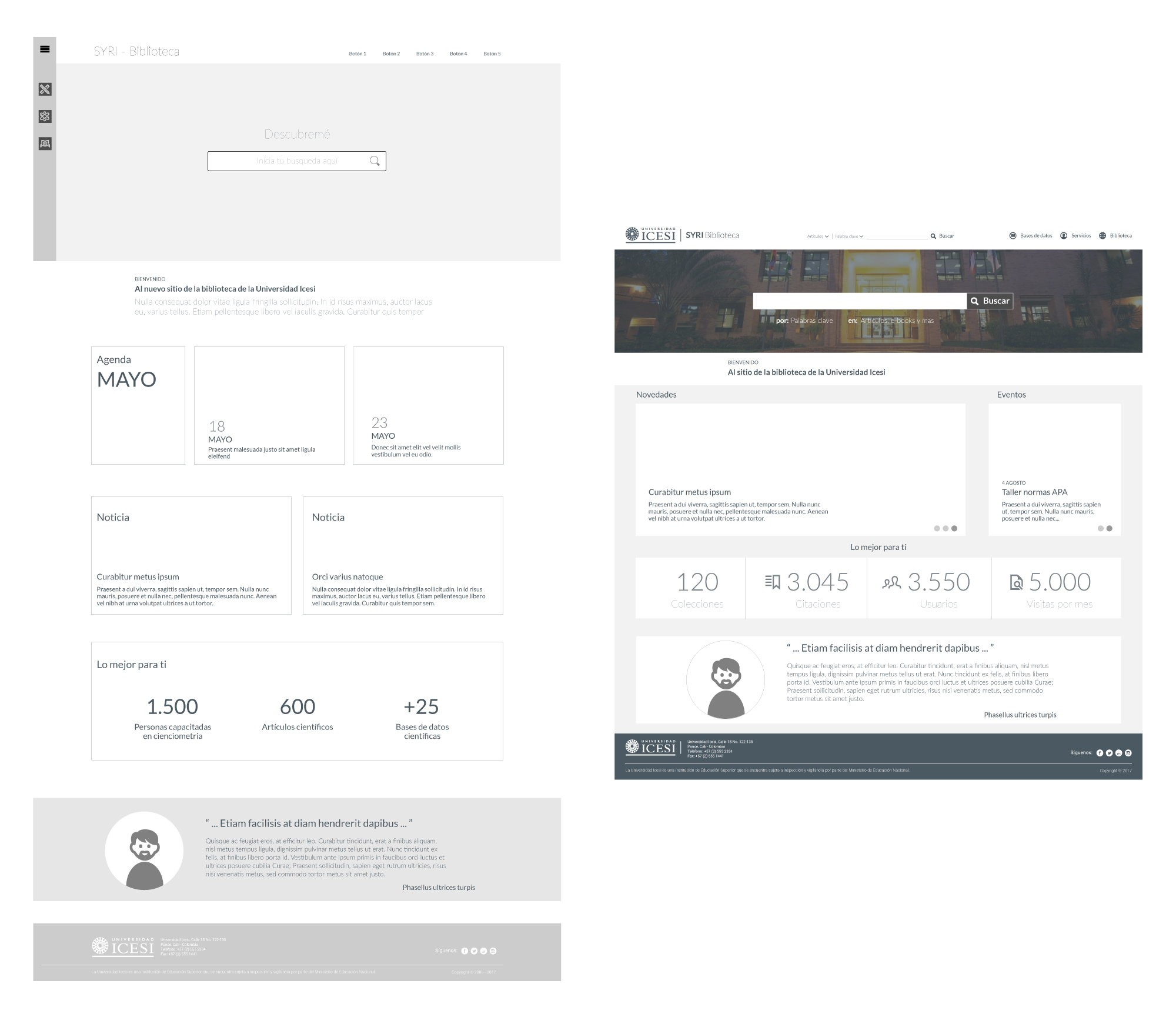
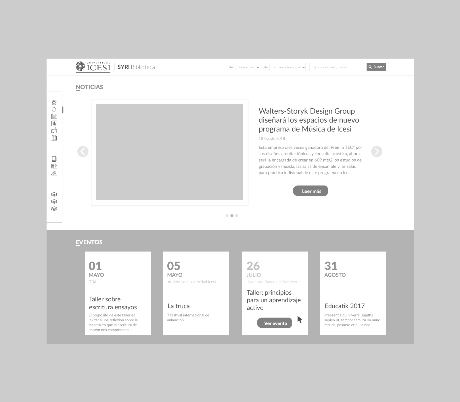
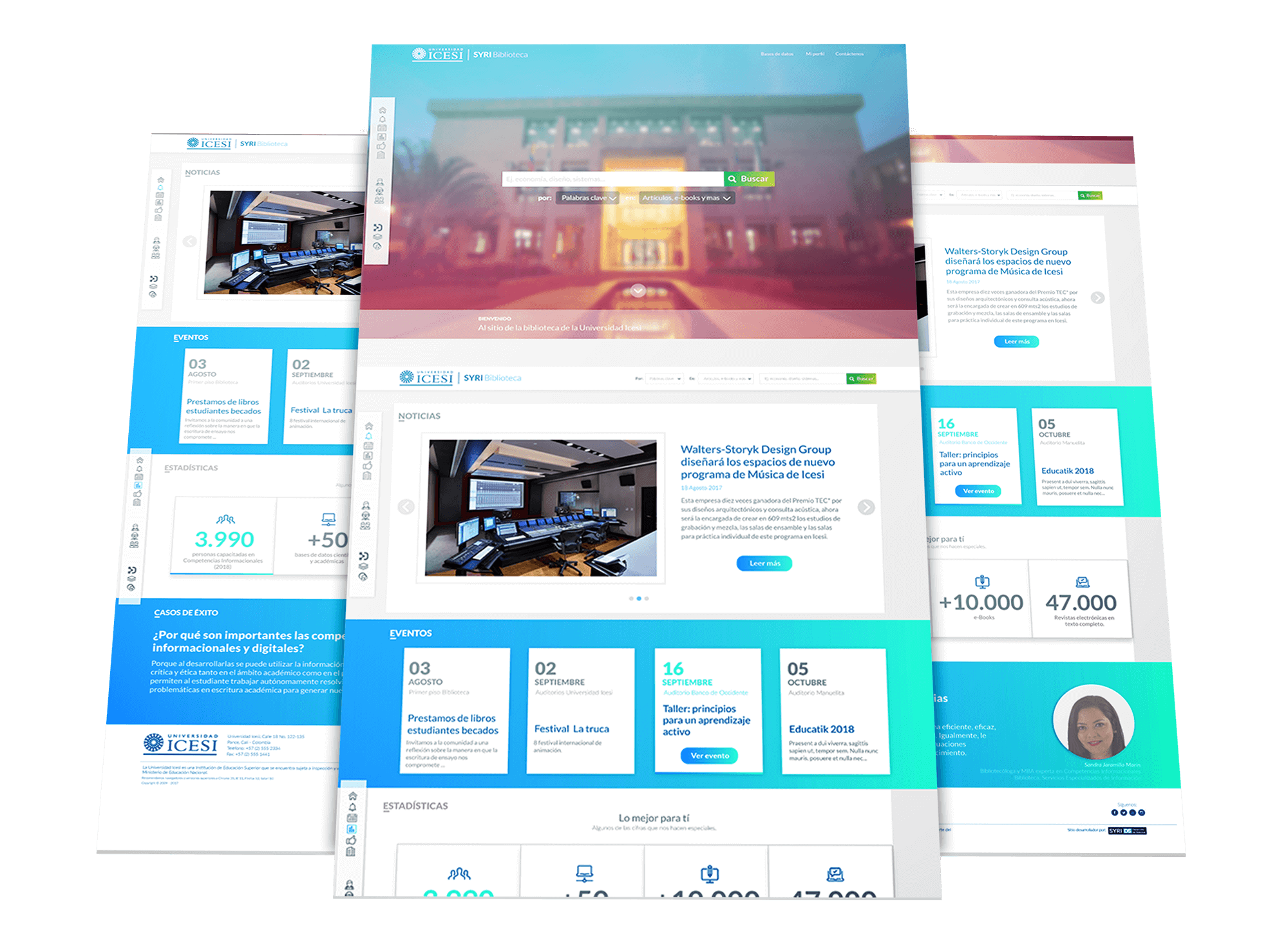
The site should emphasize using a unified search engine, allowing it to publish news and events quickly and efficiently to keep up to date with all the institutional content of the Library.
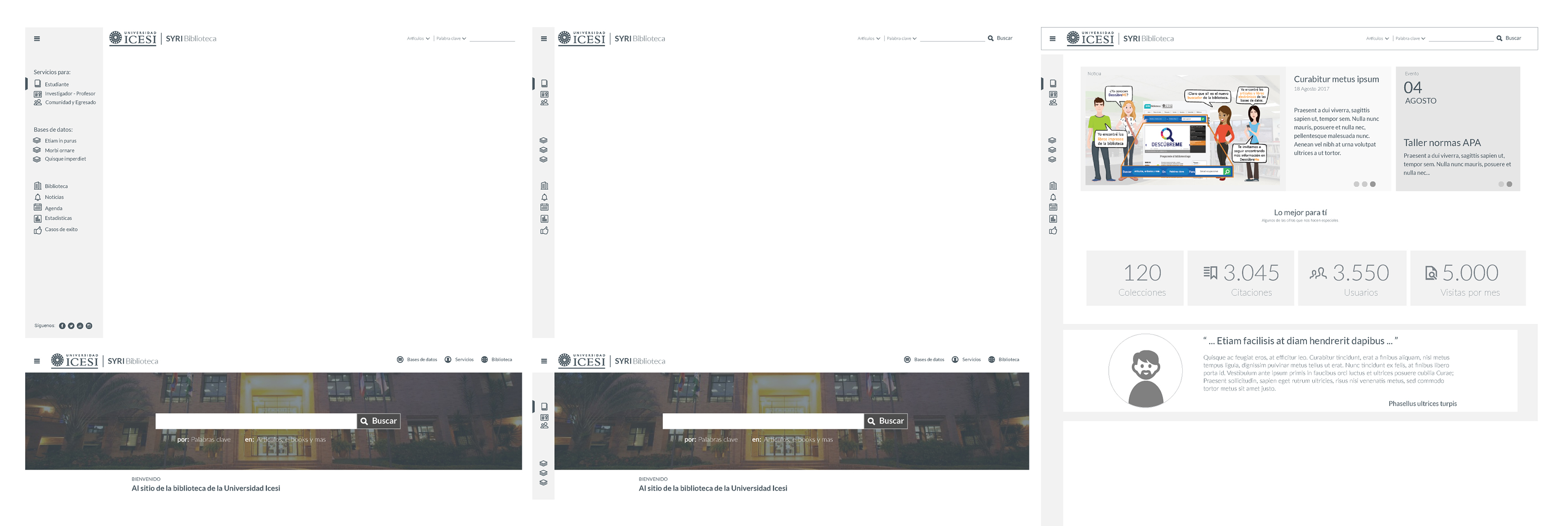
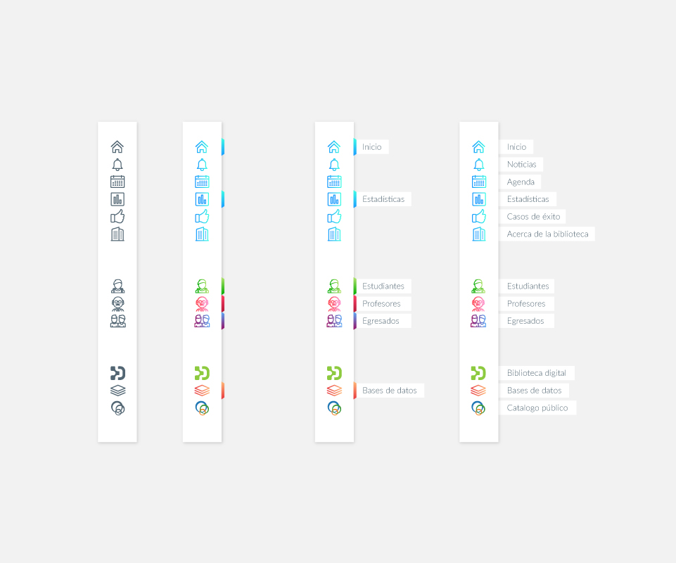
The Library’s primary users were students, teachers, and graduates; each group required services with different conditions and should be easily distinguished.
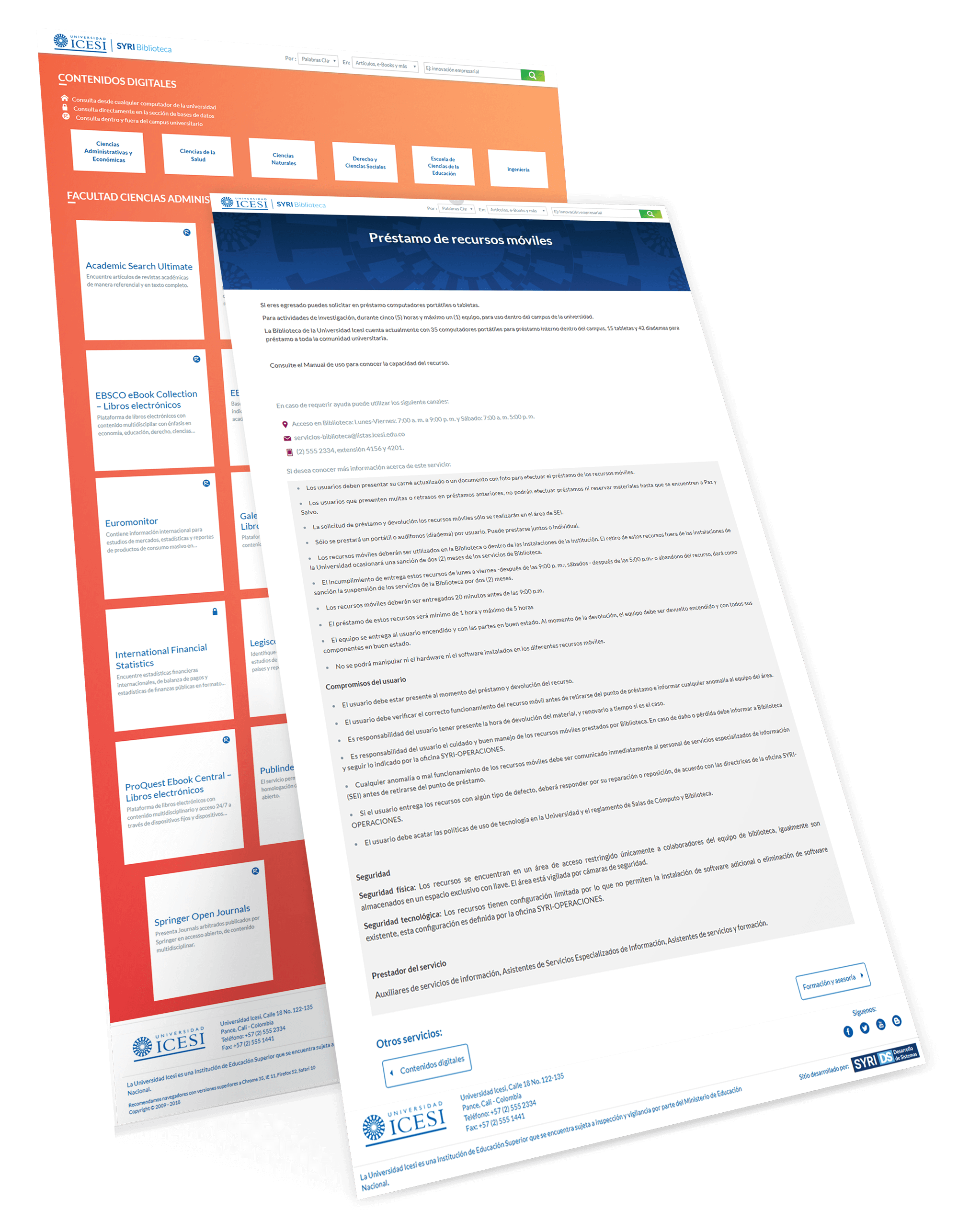
The databases had to be categorized by faculties; it had to inform the access type and the credentials required for each case.
Additionally, the site should be more eye-catching, load fast and improve search engine rankings.
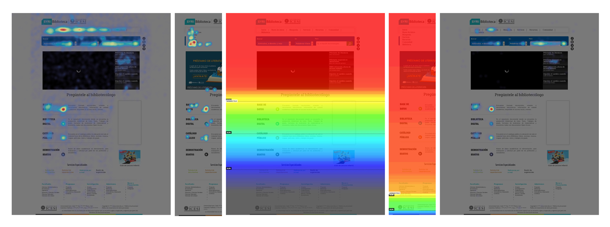
Site monitoring was done for two months; in this period, user tracking tools were used to obtain heat maps of mouse movement, number of clicks, and scroll and record as they navigated the site.
The heat map site was analyzed to find those areas’ most critical view of current users and was confronted with reports from Google Analytics. Finally, an analysis of the engine rankings of the site was made and validated with Google Search Console, which was the site’s top search.
The concept
This proposal seeks a way of efficient communication between the Library and the university community, improving the user experience by showing the different services and resources a more transparent and usable way to get users to navigate more efficiently and find the information they need in less time.
Each service of the Library has information to guide the user in its usage, who is responsible for the service, contact details, and frequently asked questions.
On the other hand, segmentation is added according to the type of user. Depending on that, the relevant services are filtered for each of the segments throughout each profile seeks to minimize the number of clicks required to access the service and have clear and concise information.
The exploration
Design concept
The portal design has been influenced by the design pattern Google Material Design, looking at saturated colors, solid surfaces, sans-serif fonts, original animations, and adaptive design.
Finding a visual style
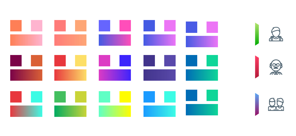
To find the identity of each profile, we created an archetype of the person for each segment in which attributes were given personality, emotions, regular expressions, and language, so color and iconography to represent them scheme was proposed.
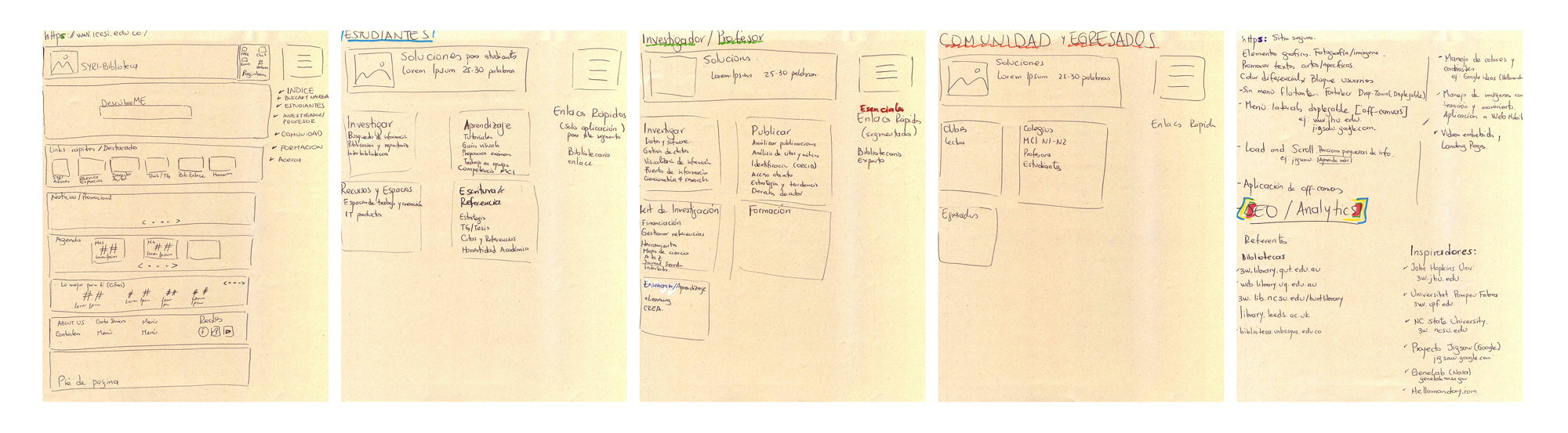
Sketches
Wireframes

Iconography & Typography
Several versions of the contents of the main menu were made; it was necessary for site development testing to achieve multiple users finding the icons that best fit each profile and identified.

Iterate 1,2,3
The development
Time to code
We begin by creating custom theme-based underscores. Because it offers a clean code, we seek to limit 35 to the maximum number of requests to the server for faster loading.
The main menu using this site represented a significant challenge. It was to be administrable by a non-expert user and scalable over time due to the possibility of creating or closing services.
A 4-way menu was registered in the backend for different site sections in case the main menu was necessary to inherit and make changes to the ‘walker_nav_menu’ class as a separate structure that provides the CMS to integrate adequately needed icons, text, color, and their respective animation.
The main menu was built on a grid within a file SVG ensuring the proper deployment on mobile devices and through CSS positions loaded image content required. The other site menus and icons are monotone and use a font created with icomoon.
All the site styles are based on the SMACSS standard; with the help of SASS files, reusable modules and mixins were created.
To facilitate site content management, a plugin that records the different types of content was created regardless of the features of the subject if a plan is to use another. This way, I managed the site’s events and news as articles and blog type ordering them chronologically. Services and databases are registered as pages that are not updated very often. Each content type has custom fields facilitating their site management to non-expert users.
The workflow used was: VScode + NPM modules + gulp.js + Sass + WordPress
The product
Solving the problems with a digital solution
The home page offers four primary blocks of information; the main menu offers three blocks of shortcuts within each service page, a summary of the service, a call to action (CTA) to access the service, essential data access, and a button bar in which you can expand information as terms and conditions, FAQs, manuals, training, and others.
Although the search engine database was outsourced, the provider gave an HTML file with CSS and JavaScript inline static; it was necessary to reconfigure the entire code by passing a model view controller to be responsive. SASS and JS files were created separately for easy maintenance and scalability.
Site support is channeled to a single form, directly served by library officials, significantly reducing user response times.

BOOM!!!
View project
Icesi University Library
The results
A new standard
After three months of use, the user access to the site increased by 25% from a mobile device, monthly visits went to their highest top, went from 2.5K to 6.5K, bounce rate was reduced on-site from one average duration of 1 minute to 2:30 minutes per visit.
The theme was developed with semantic content that allows better positioning of internal links. Additionally, the site charged in about 0.3 seconds thanks to reduced requests to the server and web optimization.
It went from 7 clicks in 1:30 minutes on average to 30 seconds with three clicks to perform a search. Besides, searching from any device on and off campus was possible with only one authentication.
Lessons learned
Occasionally in the Library arose projects that occupied 100% of the time of its officials, so we could not move forward until they could free up space for this.
What works best for me is to make a schedule of activities that require the officials and tasks of autonomous work, so I give higher preference to those who need the presence of someone else and downtime progress on individual missions to achieve shortened response times.
The product’s technical and aesthetic level was completed within the planned date but had to wait for almost an extra for the client to update the content, so it is essential to anticipate the tasks by the client to achieve give tentative dates developmental month accurately.